Camelot-MC_white logo

Finding your Fit-for-Purpose Visualization Tool

Reading Time: 3 Min.

Share

The need for data visualization grows with the amount of data you want to analyze. The CAMELOT BI&A Tools Comparison compares visualization tools in various categories and finds the best fit for your specific needs.

As the need for data visualization has been growing for years, more visualization tools are emerging on the market. Choosing the most appropriate tool for an organization has become increasingly complex. This article presents our approach to a comparison tool in the field of data visualization. The benefit of this vendor-neutral approach with the CAMELOT BI&A Tools Comparison: It compares the tools in customized criteria and finds the best fit for your specific needs. The methodology introduced here provides a side-by-side comparison of various known visualization tools, enabling their assessment on different kinds of data and use cases. The following sections outline the key challenges and requirements for a tool comparison in an organization and state the developed approach and its design principles along with the compared tools.

Rapid Data Growth and its Challenges for Data Visualization

Nowadays, the data collected by companies is becoming more and more complex and is stored at an unprecedented scale. This creates new challenges in analyzing this vast amount of data, such as the demand for faster and more customized data processing in visualization tools, to enable decision makers and stakeholders to gain more insights and remain responsive and competitive in the market. Without visualization, communicating data findings becomes challenging and identifying patterns in big data is almost impossible.

Ideally, new visualization tools should allow different setting options and appropriate features that are suitable for the data collected. Criteria such as collaboration and customization capabilities are also considered very important and can provide the flexibility needed in today’s way of working to interact with the data seamlessly. Every company has different use cases and business needs, so it is important to evaluate the tool and tailor it to the specific requirements. Due to the wide variety of tools on the market and the specialized requirements in each area, choosing the right visualization tool for a specific task can be very complex.

Tool Comparison Approach and its Design Principles

To overcome these challenges, a tool comparison can help make the optimal choice by evaluating visualization tools with respect to a specific task. The tool comparison provided by CAMELOT offers an interactive approach that is easy to use and to customize on multiple devices, with the ability to filter evaluation criteria based on preferred features. After analyzing market-related business needs, the criteria selection provided in the comparison tool allows for a tailored and specific evaluation of the tool for each use case. This allows you to narrow down the choice from a long list of tools and select the most suitable candidate for your business.

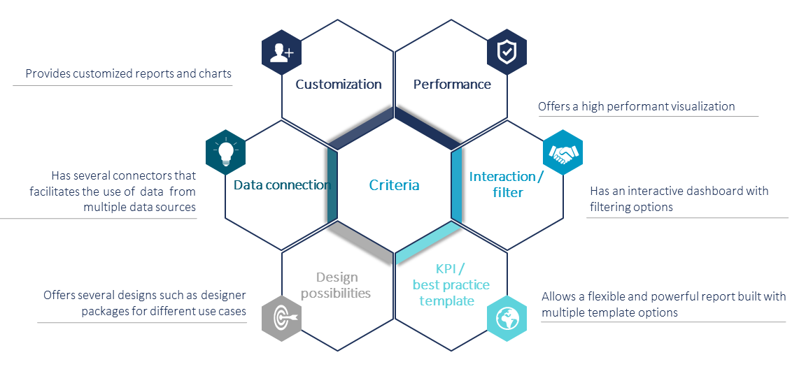
After a market screening and expert interviews, more than 15 criteria were selected to form a solid basis for the evaluation of visualization tools. These criteria represent the essential requirements for data visualization and can be filtered out or selected depending on the underlying data and the task at hand. The tool also offers the possibility to add customer-specific criteria, so you can customize it to your needs. The most important criteria (as shown in figure 1) are customization, performance, interaction or filter options, data connection, KPIs and a best practice template, design possibilities.

Figure 1: Chosen criteria for the tool comparison


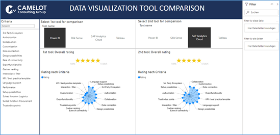
In the CAMELOT BI&A Tools Comparison, the user can select two visualization tools for a side-by-side comparison according to the selected criteria. In addition, the interactive rating allows the immediate selection or removal of some criteria and the display of the overall rating as well as the criteria ratings in real time.

Figure 2 provides an overview of the interface of this tool comparison, which is based on Power BI for its attractiveness and ease of interactivity.

Figure 2: Interface of the Data Visualization Tool Comparison

Use Case on Four Leader Visualization Tools

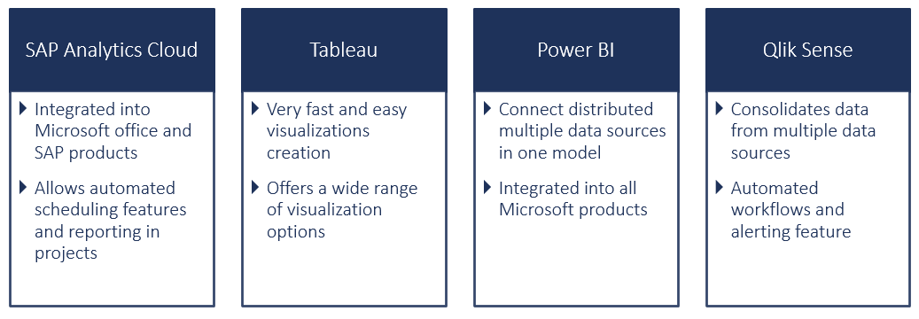
This tool comparison can be used in several use cases with all market relevant solutions. As an example, the approach was applied on four leading visualization tools. Each of them offers a wide range of features and functionalities. An overview of their key assets is shown in Figure 3.

Figure 3: Key assets of the compared tools


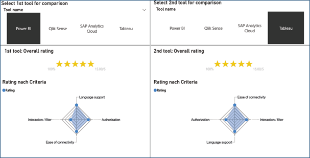
These tools were compared and evaluated separately by experts in the field of data visualization and based on current studies and publications for each of the defined criteria. These evaluations provide an objective basis that supports the comparison of the tools for later use in future projects. An overview of a pair comparison for Power BI and Tableau based on four selected criteria is shown in Figure 4.

Figure 4: Overview of the pairwise assessment of the visualization tools

Benefits of the Tool Comparison

A proper visualization tool helps to gain insights, understanding the meaning of the data and making the data discovery useful for the business. Therefore, a thoughtful tool comparison in the field of data visualization is a must nowadays to select the best solution for visualizing the huge amount of data according to the desired outcome, domain and format of the data. This tool comparison can easily be part of any project in the field of data analysis helping to improve the visualization quality and to fulfill the requirements and needs within an organization.

What’s in for You?

Choosing the best suited tool for your project contributes significantly to its success. At Camelot, we can help you throughout your data analytics project thanks to our experts’ knowledge and experience in the field. With our tool-based and agnostic approach, we can guide you in choosing the best visualization solution for your needs in many domains and areas. Also, from data virtualization to data visualization, our experts can offer you the support needed to add value to your data and accompany you through your journey towards explorative analytics.

Latest Blog Posts